Decoding Tesla’s Iconic Logo: More Than Just a ‘T’
Tesla, the eminent name in the electric automotive world, boasts a unique emblem where the letter ‘T’ holds the spotlight. This intriguing emblem is perceived to be more than just an artistic representation of the initial of the company’s name. It’s widely understood that the ‘T’ in Tesla’s logo pays tribute to the essential component of their innovative product – the electric motor.
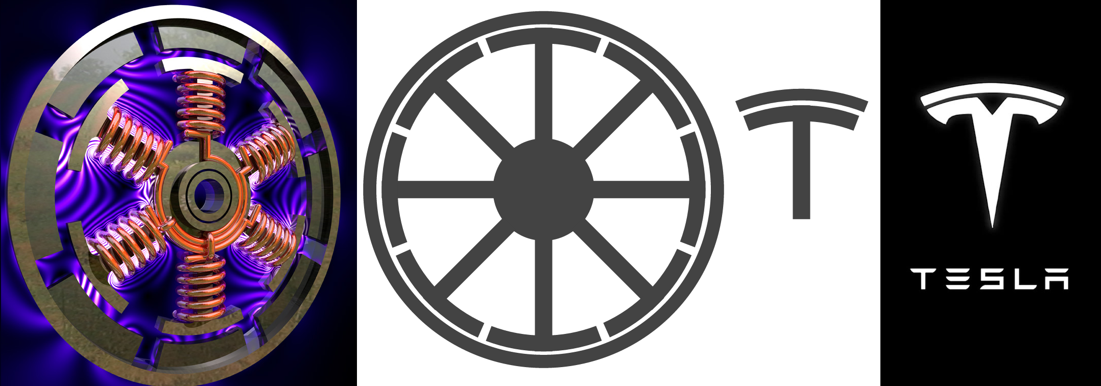
Despite Tesla’s worldwide fame, their logo has been the subject of mystery, harboring concealed layers of meaning and design. With its modern and abstract rendition of the letter ‘T’, the logo is speculated to depict the cross-sectional view of an electric motor, an element that continues to fuel conversations online.
Enthusiasm around the emblem ignited on internet forums, particularly Reddit, where users began openly questioning the significance of the logo’s design. Amidst the ubiquitous ‘T’, they pondered, what else does the Tesla symbol epitomize? Is it associated with some motor part that escapes the layman’s eye?
This inquiry gave birth to a wave of conjectures on the social platform. Reddit users brought their thoughts to the table, with some offering serious interpretations, and others, humorous. Still, amidst these surmises, the substantial explanation initially managed to escape quite a few.
One participant in the discussion put forth an educated guess that the logo might represent a fragment of an induction motor’s cross-section. This seemed a credible theory given Tesla’s deep-seated association with electric vehicles. Differing from this line of thought, another user humorously suggested that it mirrors a feline’s nostril.
Adding to the array of interpretations, one observer noted the multiplicity of convincing suggestions. Regardless of whether the logo symbolized an element from an induction motor, drew inspiration from an electric schematic’s battery, echoed the iconic Ford Model T, mirrored the Serbian axes, or even abstractly referenced Nikola Tesla’s facial features, it was unambiguously a brilliant work of art.
The design’s elegance stood out, irrespective of whether its conception was intentional or a fortuitous product of creativity. Positioned at the heart of these conversations was Tesla, the American company dedicated to designing electric vehicles and promoting clean energy solutions.
Established in 2003, Tesla was originally christened ‘Tesla Motors.’ The founders, Martin Eberhard and Marc Tarpenning, chose the name to honor the illustrious inventor, Nikola Tesla. By February of the subsequent year, Elon Musk had led the first round of investment, securing the company’s captaincy initially as chairman, before donning the CEO’s hat in 2008.
Even though Tesla has become a household name, some ambiguity around the company’s logo remains. The original Tesla emblem, initially crafted to be enclosed in a shield icon, underwent transformation. Although the shield concept was ultimately abandoned, the consequential standalone ‘T’ swiftly became a globally recognized symbol.
While it’s easy to assume that the company’s logo is merely an elegant portrayal of the letter ‘T’, the symbolism runs deep into the lifeblood of the corporation itself. It is a well-thought-out design intended to illustrate a slice of an electric motor, an element that firmly stands at the core of Tesla’s creations.
The Tesla emblem is designed to mirror the anatomy of an electric motor. Analyzing it closely, one realizes that the logo represents one of the poles that emerge from a motor’s rotor. Concurrently, the top line of the design symbolizes a component of a stator.
Indeed, the logo purposefully creates a representation of an electric-motor cross-section with strategic repetition of the Tesla emblem. By arranging the emblem in a circular pattern, each ‘T’ oriented outward, the logo indemnifies as more than just a letter. It becomes an artistic interpretation of the very technology that Tesla champions.

